Thursday, October 30, 2014

CMYK cover design

This is From the 54th issue of CMYK. It's the cover of the magazine created by John Langdon. 

I personally enjoyed the contrast of the simple layout and the complex logo. And all the colors chosen work very well together. It is also very smart to put CMYK and the issue number together. In a word, It was amazing to feel modern and classic at the same time. 

Saturday, October 25, 2014

Brazilian Cover

This image was from Lurzer's Archive's volume 5 in 2014. It was designed by Agencia Africa, Sao Paulo Agency. This issue was featuring Brazilian designs.

I personally found this image interesting because It was really new to me. I never saw anything like this before. Twisting men's facial features could have striking feelings. This was the cover of the volume. Like the editor described " Apart from the fact that it is a striking image, there is another very good reason for making an image from Brazil our cover: never before in the history of the magazine has Brazilian creativity dominated a single issue as much as it does this time around."

I believe every single culture has their own taste of design or art, and there is no answer to which one is better. We have to admire the essence of each one.

Thursday, October 16, 2014

The beauty of Sharpness (knife ad)

This print was from Luerzer's Archive's week 26 of 2014. 

The Client: Miyabi
Ad Agency: Herezie, Paris
Creative Director: Andrea Stillacci
Art Director: Nicolas Duménil, Jacques Denain

Photographer: Pierre Baelen
Digital Artist: La Souris sur le Gateau

This is an advertisement designed for artisan knife from Miyabi. I personally love this print a lot. First of all, the photographer did a very good job to capture and compose the image. Using the intersection of two piece of melons to form the shape of knife is really genius. And the melons are really crisp and it made you think of what kind of knife cut them. Also, the designer did a good job to arrange the text below to form the handle of the knife. In a word, it was really a inspirational design, simple but effective. I enjoy it a lot. 

Thursday, October 9, 2014

self-cleaning oven

This was published on Lurzer's Archive's 38th ad of the week, 2014. It was designed for "self-cleaning oven" by the Arçelik home appliances brand. It came from Young & Rubicam, Istanbul with visuals created by Romanian digital imaging wizards, Carioca Studio.

I personally enjoyed the design because the visual content was humorous. Although, I felt the cow had nothing to do with the oven, watching a cow licking himself like a cat still brilliantly caught the concept of "self-cleaning." In this sense, I believe it was a successful advertisement.

Friday, October 3, 2014

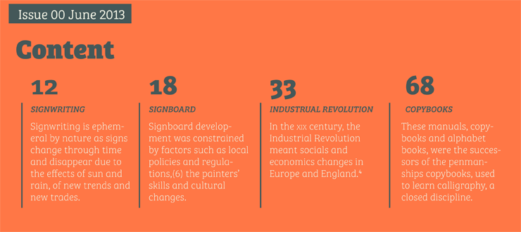
Bree Serif


I found the above types very clear to read but also have a lot energy and preserve the modern feel at the same time. It won gold award in the European Design Award in 2014.  The following is a brief history and characteristics of this "Bree Serif" font from http://www.type-together.com/Bree%20Serif

"In 2008 TypeTogether released the Bree typeface, a sleek sans serif that quickly became a favorite among brand and editorial designers.


Bree Serif follows the same theme as its predecessor. It is a young and energetic upright italic that approaches readers with hip and somewhat elegant charm. It has a range of styles that can perform as counterparts to the original Bree fonts. At the same time though they bring a whole range of new and individual features that make Bree Serif a separate type family in its own right.


The characters in Bree Serif maintain the original flavour of handwriting, but have a more subtle appearance to support optimal editorial usage. The slabby nature of its shapes, particularly in the heavier weights, makes for a strong impression.


Some of the characteristic features of its sans serif cousin are present in Bree Serif too, such as the single-story ‘a’, the cursive ‘e’ and the rhythmical ‘k’ and ‘y’. Alternate letters of these are also available when a more neutral look is desired.
Bree Serif offers a mixture of fluid and attractive forms that convey a contemporary and vivid aspect. If you loved the multi- award winning Bree, you will surely love its seriffed cousin!"


The project information is below.


  • Project Credits
    • Designers: Veronika Burian, José Scaglione
    • Project Client: TypeTogether